The past three years that I have spent in Leeds has been full of highs and lows, with my work being at the forefront of the fluctuation. I have tried my hardest not to let circumstances get the better of me but this has been very hard. With all that was going on outside of the studio, my time was extremely disrupted. Coming back to college late after the Christmas break and trying to organize getting my dissertation underway whilst I was meant to also think about my design practice, everything got pushed back and started late.
My main aim at the beginning of the year was to produce work that did myself justice, and work that I could come away feeling proud to have done. Although I may not have produced a great quantity of work to feel absolutely satisfied with, I am pleased with the final designs and my ability to create an interesting piece of work.
I had originally intended on carrying on from where I had left off before Christmas, focusing upon architecture, but taking it to another level. I started this by taking the concept of silhouettes but instead of just the skyline and buildings, I chose to look at people. I had looked at a lot of live briefs, but never found one that I felt suited these intentions and that is the reason why I chose not to do any to begin with. Instead, I thought it best to try and just write my own brief.
I initially went in to Leeds city centre and took a load of photos, which is something that I had always intended on doing even if it wasn’t the same subject matter. However, after I had got all my photos together and started cutting out the coloured silhouettes, I found that this piece of work wasn’t really going anywhere as I had not really got a brief written to go with it. Having come across the work of Paulo Lim, who had created an album cover for a band by taking the band members and cutting them out in coloured paper to create a vibrant piece of work, I took my inspiration from this.
I had a chat with my housemate, who studies jazz studies at the music college, and this is when I got the music input into my work.
I thought that this was promising change of mind and started really considering what I could achieve. My housemate had said how he needed to promote himself and so I thought how I could set about to do so.
When I then had a tutorial with Joe Gilmore, I showed him what I was doing and then he thought about how I could maybe apply my ideas. Joe had told me to look into producing a flyer and/or poster to promote independent music in Leeds. This is when I moved forward from just looking at everyday people, to musicians. Having gathered some images I set about writing myself a brief. Unfortunately for myself this was to be another attempt at an unresolved initial idea but was in turn to lead me on to something a bit more successful.
After a couple of crits, whereby I didn’t really have anything to show apart from telling everyone my ideas, Aric told me about a live brief. This brief was to design the new flyer for 360 club, a club night in town that stages live music acts. Although the date had passed to submit the work, I still thought that from the ideas that were going on in my head it would be a good thing to apply them to it. I had timetabled myself to tackle this brief in a short space of time and have a quick turnaround as I had already got ideas and all that I needed to do was to come up with a few designs. Having showed people the initial ideas and after my catch-up tutorial with Joe it was clear that there needed some work doing. The main thing that was said was that they needed more detail in the people rather than just a flat colour. Joe told me to experiment with the polarization on photoshop and that is exactly what I did. I simplified the original images down to two colour and I think that the final effect from them is pretty good, it was just a shame that I could never submit the design.
My time management has probably been my biggest let down during the last couple of years, and during this final project it has been no exception. When I had originally planned to turn the 360 brief around quickly, I found myself continuously going back to it, as I never felt that I had got a final outcome, until eventually I did.
This brief in turn led me on to produce the main body of work for my final major project. Carrying the music theme forward and having already thought about producing a piece of work to promote music, I chose to look at festival promotion through a self-initiated brief. My Design Context had me focus upon contemporary mixed media illustration and it was through this that I came across the design studio, Serial Cut Studio. Having seen their work of card cutouts I applied this idea to my festival brief. I gathered photographs of people and musicians at three festivals and used these images to create 3D scenes that portrayed the essence of each festival. I was pleased with the final resolutions and thought that they worked really well. The one thing that I feel did not do myself any favour though was the fact that the images that I used were not all mine and some were taken directly form the festival galleries online. This meant that the images were not the best quality but I got around this by altering them in photoshop and in the end they didn’t affect the overall picture too much.
Knowing that I was never planning on going straight into a career path once I leave university I have not spent any real time on my PPD because I did not feel as though it was beneficial to do so. I have not been in contact with any companies other than that which I have done previous work experience for and they have said that if I ever need any help getting my portfolio together they will give me advice.
As my main ambition for when I leave is to go traveling I am putting everything else on hold. At this moment in time I do not see myself becoming a full time graphic designer but that may well change over the next few years, I’ll just have to wait and see. My knowledge of graphic design has definitely grown and I know what I do not want to do a lot more than what I do want to do. I have learnt an awful lot from my time spent studying the subject and I’m sure that even if I don’t become a full time designer I am sure that I will apply my knowledge to something in the creative industry.
Monday 15 June 2009
Sunday 7 June 2009
Thursday 4 June 2009
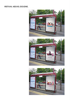
Festival Bus AD.


These are the final designs for the bus ads. I think that they work quite well but i could possibly have considered the resolution a bit more. The one thing that i didn't do was take specific photos for them and so i had to play around to fit the images in to the required space. All in all i do feel that they get the message across and continue the theme from the billboard posters.
Monday 1 June 2009
festival - final designs


These are the final designs for the billboard posters of each festival. I am quite pleased with the overall result and think that they work well as a set together too. Adding in the background gives the imagery another dimension and just finishes it off, rather than just having a white back drop.
The colours that i have chosen for each poster are there to represent what the festival's are all about and the vibe that they have. Bestival has a summery and friendly feel with a blue sky and green grass, Globalgathering has more of a drug induced rave vibe with purple grass and a yellow sky, while Download is a lot darker than both of them, to represent the gothic state.
Saturday 23 May 2009
BESTIVAL- best shots
Wednesday 20 May 2009
FINAL CRIT


For my final crit today this this is some of the work that i showed. I had put the billboards and adshels in context in order to give the rest of the group a clearer understanding of what i am trying to achieve. I am quite pleased with the way that i am heading with this work and now i just need to do some minor adjustments and maybe take a few more photos.
The feedback that i got back from the group was fairly positive and they seemed to like the work. They did say that maybe the photos aren't as 3D as they could be, so i will have to look in to this.
Subscribe to:
Posts (Atom)


